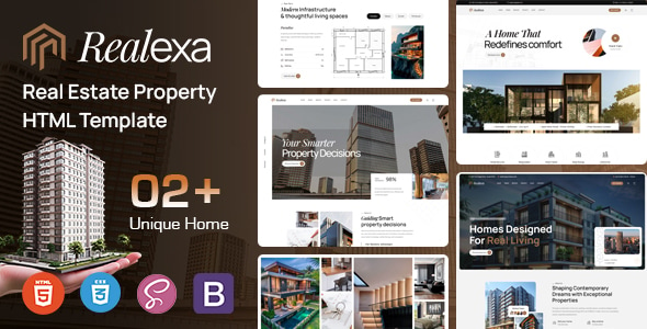
Lawrom-律师事务所 HTML 模板
Creating a lawrom-focused website with HTML and CSS requires a design that conveys professionalism, trust, and clarity. Here's a detailed description for a unique law website:
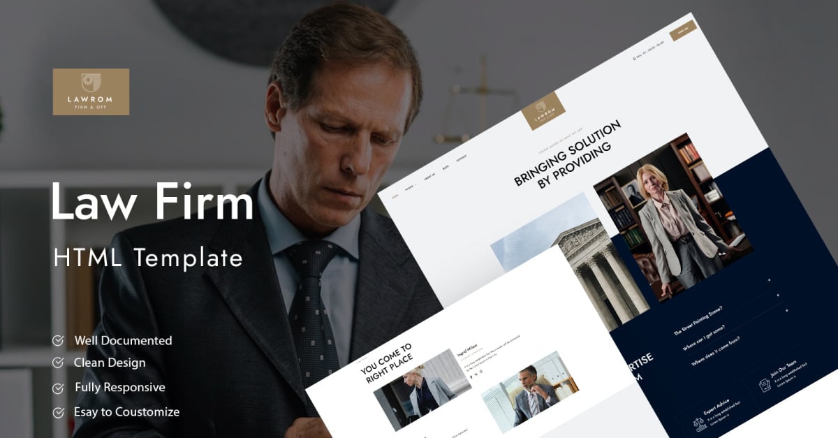
The law website, lawrom is a sleek and modern digital space designed to reflect the integrity and authority of a distinguished legal firm. It combines the elegance of minimalism with the robustness of a fully functional platform that meets the diverse needs of legal professionals and their clients.
The homepage opens with a full-width hero section featuring a high-resolution image of a grand courtroom, symbolizing justice and authority. The image is slightly desaturated to ensure the overlaid text stands out, with a subtle parallax effect adding depth as users scroll.
Centered on the hero image, the firm's name, lawrom is prominently displayed in a sophisticated serif font, evoking a sense of tradition and reliability. Below it, a concise tagline reads, "Where Justice Meets Expertise." A call-to-action (CTA) button, styled in a contrasting color, invites users to "Schedule a Consultation."
The navigation bar is sticky, following the user as they scroll. It features a clean and straightforward design with a deep navy background and white text. The menu items include Home, About Us, Practice Areas, Attorneys, Resources, and Contact. The current page is highlighted with an elegant underline animation that transitions smoothly between sections.
The About Us section is designed with a split-screen layout. On the left side, a text block provides a detailed history of the firm, written in a formal yet approachable tone. The right side showcases a dynamic image gallery with photos of the firm’s founding members, office interiors, and snapshots of the team in action. Each image can be clicked to reveal more information or quotes from the firm’s leaders.
This section uses a grid layout with high-quality icons representing different practice areas such as Corporate Law, Criminal Defense, Family Law, Intellectual Property, and more. Hover effects bring each area to life with a brief description and a "Learn More" link that directs users to a dedicated page for that service. Each page is meticulously crafted with in-depth information, including case studies, client testimonials, and relevant legal articles.
The Attorneys page is designed to humanize the team, showcasing individual profiles in a card layout. Each card includes a professional headshot, name, title, and area of expertise. Clicking on a card opens a modal with a full biography, educational background, notable cases, and a personal statement.
This section is a well-organized library of legal resources, including articles, whitepapers, FAQs, and video content. The layout is clean, with categories listed in a sidebar for easy navigation. A search bar at the top allows users to find information quickly. Each resource page is designed for readability, with a balanced use of headings, bullet points, and embedded media.
The color scheme revolves around deep navy blues, soft grays, and touches of gold, exuding professionalism and trustworthiness. The typography is a mix of serif fonts for headers, giving a traditional feel, and sans-serif fonts for body text, ensuring readability. The overall design is responsive, ensuring that the website looks impeccable on all devices, from large desktop screens to mobile phones.
Subtle CSS animations are used throughout the site to enhance the user experience without overwhelming the visitor. These include hover effects on buttons, smooth scrolling between sections, and fade-in animations as elements come into view. Interactive elements like drop-down menus and expandable FAQ sections are implemented with accessibility in mind, ensuring that all users can navigate the site with ease.
$7 $14
| Last Update | |
| Published | 16-09-2024 |
| High Resolution | Yes |
| Files Included | HTML files, CSS files, JS files, Images,... |
| Tags |
